How to Create a Finance Report in Excel

Creating finance reports in Excel is a valuable skill for any business professional. At Devine Consulting, we’ve seen how mastering this process can transform financial data into clear, actionable insights.
This guide will walk you through the steps to build comprehensive finance reports using Excel’s powerful features. From setting up your workbook to visualizing data with charts, you’ll learn how to create professional-grade financial statements efficiently.
How to Set Up Your Excel Workbook for Financial Reporting
Create and Name Your Workbook
Start your financial reporting journey by creating a new Excel workbook. Give it a descriptive name (e.g., “Q3_2025_Financial_Report”). This simple step will help you locate and identify your report easily in the future.
Next, rename your sheets to reflect their contents. Use clear titles like “Income Statement”, “Balance Sheet”, and “Cash Flow”. This organization makes navigation much easier, especially in complex reports with multiple sheets.
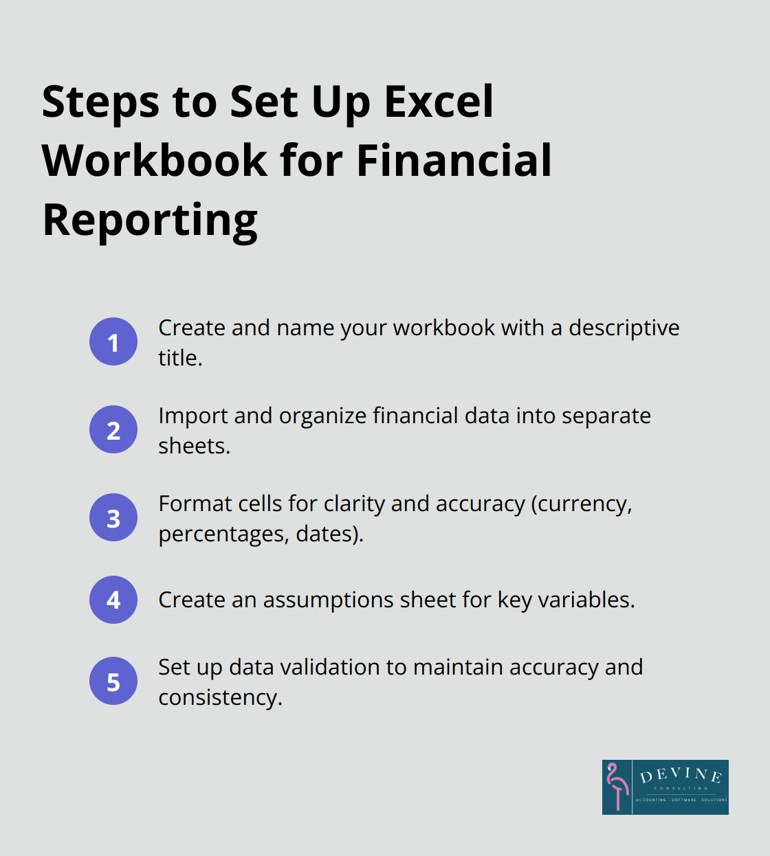
Import and Organize Financial Data
It’s time to bring in your financial data. If you use accounting software, export your data in a format compatible with Excel (such as CSV). Use Excel’s “Get Data” feature to import this information. Place raw data on separate sheets to keep your main report sheets clean and organized.
For manual data entry, create clearly labeled columns for each financial metric. Use consistent naming conventions across all sheets. This consistency is crucial for accurate calculations and easy reference later on.
Format for Clarity and Accuracy
Proper formatting transforms your data into a professional-looking report. Use the “Format Cells” dialog to set up your number formats:
- Currency: Choose your local currency symbol and set decimal places to two.
- Percentages: Select the percentage format and decide on the number of decimal places (usually one or two).
- Dates: Pick a consistent date format across your workbook.
Apply these formats to entire columns to ensure consistency as you add new data.
Create an Assumptions Sheet
An Assumptions sheet for key variables (like tax rates or growth projections) can be incredibly useful. This centralized approach makes it easy to update these figures across your entire report. It also provides a quick reference for anyone reviewing your financial model.
Set Up Data Validation
Use Excel’s data validation feature to maintain accuracy and consistency in your financial reports. For example, set up drop-down lists for categories or limit input ranges for percentages (0% to 100%). This step reduces the risk of incorrect data entry and improves the overall reliability of your report.
With your workbook now properly set up, you’re ready to move on to the next crucial step: creating key financial statements. This solid foundation will make the process of building your income statement, balance sheet, and cash flow statement much smoother and more efficient.
Building Financial Statements in Excel
Crafting Your Income Statement
The income statement (also known as the profit and loss statement) shows your revenue, expenses, and profit over a specific period. Set up columns for the current period, year-to-date, and previous year for comparison.
List all income sources at the top, then use the SUM function to calculate total revenue. Next, list your expenses, categorized into groups like cost of goods sold, operating expenses, and taxes. Use SUM to total each category.
Calculate gross profit by subtracting cost of goods sold from revenue. For operating profit, subtract operating expenses from gross profit. Finally, calculate net profit by subtracting taxes and any other expenses from operating profit.
Assembling the Balance Sheet
The balance sheet provides a snapshot of your company’s financial position at a specific point in time. Create three main sections: assets, liabilities, and equity.
Under assets, list current assets (such as cash and accounts receivable) and long-term assets (like property and equipment). In the liabilities section, separate current liabilities (e.g., accounts payable) from long-term liabilities (such as loans).
Include owner’s equity, retained earnings, and any other relevant equity accounts in the equity section. Your total assets must equal the sum of your liabilities and equity. Use Excel’s built-in error checking to ensure this balance.
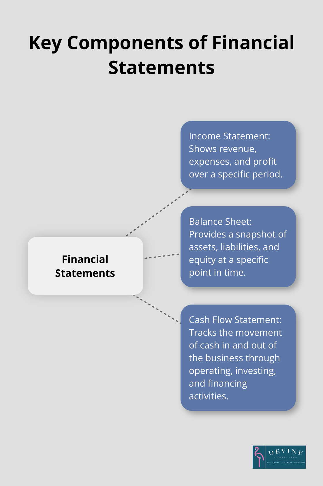
Generating the Cash Flow Statement
The cash flow statement tracks the movement of cash in and out of your business. Organize this statement into three sections: operating activities, investing activities, and financing activities.
Start with net income from your income statement. Then, adjust for non-cash expenses (like depreciation). Use Excel’s VLOOKUP function to pull relevant figures from your other statements.
For investing activities, include cash spent on or received from long-term investments. Financing activities might include loans received or dividends paid. Sum each section separately, then calculate the net change in cash at the bottom.
Ensuring Accuracy and Consistency
To maintain accurate financial statements, implement these best practices:
- Use consistent formatting across all statements.
- Double-check all formulas and links between sheets.
- Reconcile your statements regularly to catch any discrepancies.
Leveraging Excel’s Advanced Features
Excel offers powerful tools to enhance your financial statements:
- Use PivotTables for dynamic data analysis.
- Create custom functions for complex calculations.
- Set up data validation rules to prevent errors.
These advanced features can streamline your reporting process and provide deeper insights into your financial data.
With your financial statements complete, you’re ready to take your report to the next level. The following section will explore how to enhance your financial report with charts and graphs, transforming raw data into visually compelling insights.
How to Visualize Financial Data in Excel
Excel’s charting capabilities transform raw financial data into compelling visual stories. Well-crafted charts make complex financial information accessible to stakeholders at all levels.
Create a Revenue Trend Line Chart
To illustrate revenue trends, select your revenue data and the corresponding time periods. Click ‘Insert’ > ‘Line Chart’. Choose a style that clearly shows the trend over time. Add data labels to highlight key points or milestones.
For more impact, overlay multiple revenue streams on the same chart. Use different colors for each line and include a legend. This approach allows for quick comparison of various income sources over time.
Build an Expense Breakdown Pie Chart
For a clear view of expense distribution, create a pie chart. Select your categorized expense data, then click ‘Insert’ > ‘Pie Chart’. Choose a 2D or 3D style based on your preference.
To enhance readability, use the ‘Format Data Labels’ option to display both category names and percentages. Consider using a ‘doughnut’ chart style if you want to emphasize the largest expense categories.
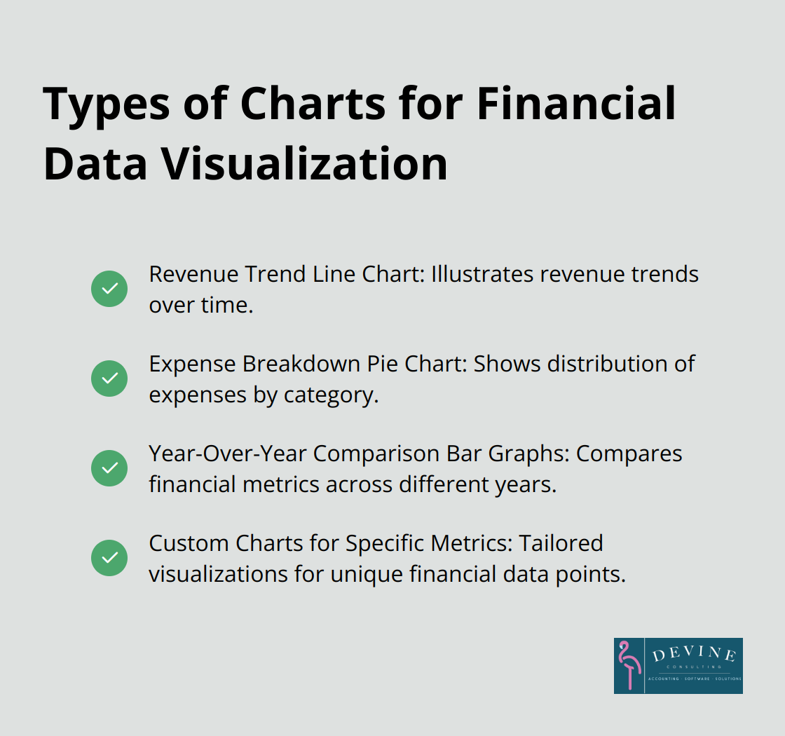
Design Year-Over-Year Comparison Bar Graphs
Bar graphs excel at showing year-over-year comparisons. Select data for at least two years, then click ‘Insert’ > ‘Clustered Column’. This creates side-by-side bars for easy comparison.
To make the chart more informative, add data labels showing the actual values or percentage changes. Use consistent colors for each year to maintain visual clarity across multiple metrics.
Enhance Chart Readability
Choose colors that align with your brand and ensure consistency across all charts in your report. Use contrasting colors for different data series to improve visibility. Add clear titles and labels to each chart (this helps viewers quickly understand the information presented).
Update Charts Regularly
Keep your financial narrative current and relevant by updating these visuals as new data becomes available. Set up your Excel workbook to automatically update charts when you input new data (this saves time and reduces the risk of errors).
By mastering these visualization techniques, you can transform complex financial information into clear, actionable insights that elevate your finance reports.
Final Thoughts
Excel empowers users to create comprehensive finance reports with ease. Its robust features allow for data manipulation, complex calculations, and dynamic visualizations. Regular updates and customization of Excel templates ensure that finance reports remain effective and relevant as businesses evolve.
We at Devine Consulting understand the importance of clear financial reporting. Our team of experts can help you develop and refine your Excel-based finance reports. We support your financial management needs across various industries, including construction, oil and gas, and real estate.
Excel skills for finance reports transform financial management. Mastering these techniques will produce clear, accurate, and visually appealing financial statements. These reports will drive informed decision-making and become invaluable assets for business growth.