How to Create an Effective Finance Report Presentation

Creating a finance report presentation that captivates your audience and delivers key insights is a skill every financial professional should master. At Devine Consulting, we’ve seen how well-crafted reports can drive better decision-making and boost organizational performance.
This guide will walk you through the essential steps to create an effective finance report presentation, from understanding your audience to leveraging powerful data visualization techniques.
Who Are You Presenting To?
Know Your Stakeholders
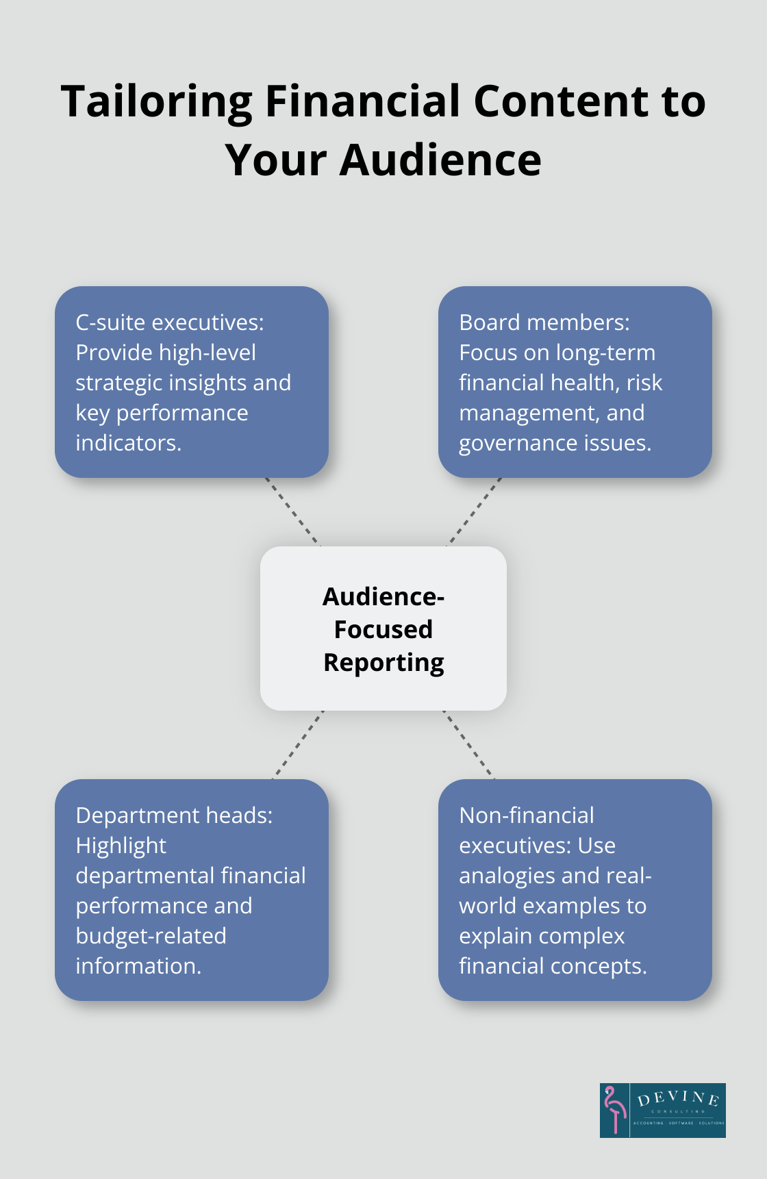
Understanding your audience forms the foundation of an effective finance report presentation. Before you start crafting your presentation, identify who will attend. Are you presenting to C-suite executives, board members, or department heads? Each group has different priorities and levels of financial expertise. CEOs might prefer high-level strategic insights, while CFOs will likely want to examine the numbers in detail.
Set Clear Objectives
After you’ve identified your audience, define the objectives of your financial report. Are you seeking approval for a new project, explaining quarterly results, or proposing budget changes? Your objectives will guide the content and structure of your presentation.
For example, if you’re presenting to secure funding for a new initiative, focus on ROI projections and risk assessments. If you’re explaining quarterly results, highlight key performance indicators and variances from forecasts.
Speak Their Language
Tailor your content to match your audience’s financial literacy level. A room full of accountants will appreciate technical details, while non-financial executives might prefer a more high-level overview with clear explanations of complex terms.
AFP called in some experts to help finance professionals become better communicators in their FP&A series. To bridge communication gaps, consider using analogies or real-world examples to explain complex financial concepts.
Use Appropriate Terminology
The goal is not to showcase your financial expertise, but to ensure your audience understands and can act on the information you’re presenting. Try to use terms that resonate with your audience. For instance, when presenting to marketing executives, you might frame financial data in terms of customer acquisition costs or lifetime value.
Anticipate Questions
Prepare for potential questions your audience might ask. This preparation will help you address concerns proactively and demonstrate your thorough understanding of the financial data you’re presenting.
Now that you’ve identified your audience and tailored your approach, let’s move on to structuring your finance report presentation for maximum impact.
How to Structure Your Finance Report for Maximum Impact
A well-structured finance report forms the backbone of effective financial communication. A logical flow of information helps stakeholders grasp complex financial data quickly and make informed decisions.
Start Strong with an Executive Summary
Begin your presentation with a concise executive summary. This section should highlight the most critical financial information and key takeaways.
Your executive summary should answer these questions:
- What are the most significant financial results?
- How do these results compare to previous periods or forecasts?
- What are the main drivers behind these results?
- What actions or decisions are required based on this information?
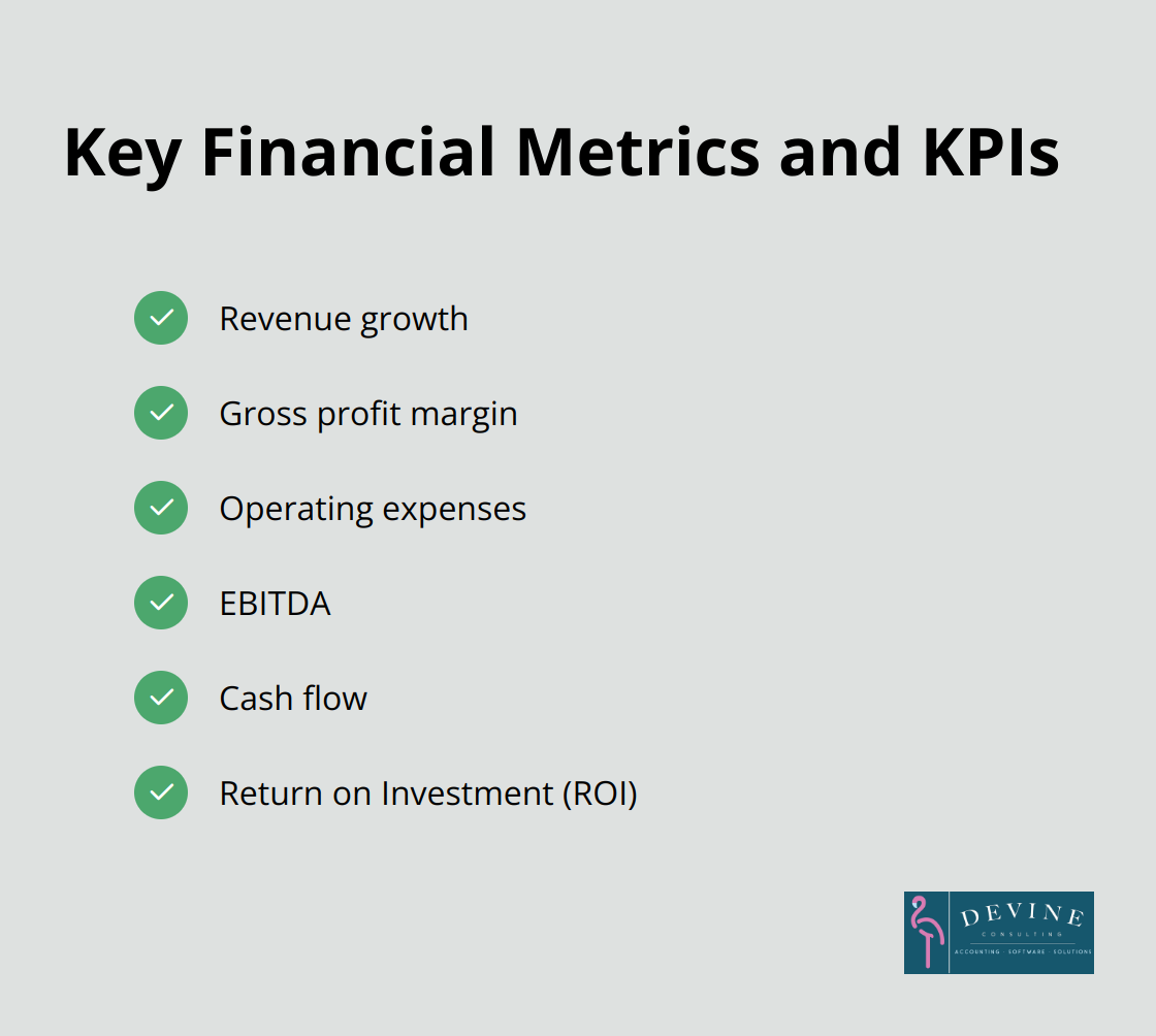
Focus on Key Financial Metrics and KPIs
After the executive summary, present the core financial metrics and Key Performance Indicators (KPIs) that matter most to your audience. The specific metrics you choose will depend on your industry and company goals, but common ones include:
- Revenue growth
- Gross profit margin
- Operating expenses
- EBITDA
- Cash flow
- Return on Investment (ROI)
Present these metrics clearly and concisely. Use visual aids like charts or graphs to make the data more digestible.
Incorporate Trend Analysis and Benchmarking
Context plays a vital role in financial reporting. Include trend analysis to show how key metrics have changed over time. This helps stakeholders understand the company’s financial trajectory and identify potential issues or opportunities.
Benchmarking against industry standards or competitors can provide valuable insights. For example, if your company’s profit margin is 15% and the industry average is 12%, that’s a positive indicator worth highlighting.
Provide Actionable Insights and Recommendations
The most valuable finance reports go beyond just presenting data – they offer insights and recommendations. Based on the financial information you’ve presented, what actions should the company take? What opportunities should be pursued? What risks need to be mitigated?
Try to be specific in your recommendations. Instead of saying “We should reduce costs,” suggest “We can reduce operating expenses by 10% by implementing these three specific measures…”
Your goal is to empower decision-makers with the information they need to drive the business forward. This structure creates a finance report presentation that not only informs but also inspires action.
Now that we’ve covered how to structure your finance report effectively, let’s explore some powerful data visualization techniques that will make your financial information more engaging and easier to understand.
How to Visualize Financial Data Effectively
Financial data visualization transforms complex information into clear, actionable insights. This chapter explores techniques to elevate your finance report presentations through smart visualization methods.
Choose the Appropriate Chart Type
The right chart type conveys your financial data effectively. Line charts excel for trend analysis and time series data. Bar charts are great for comparing values of a specific category. Pie charts show composition of a whole, such as market share distribution.
A horizontal bar chart allows easy comparison when presenting profit margins across product lines. A treemap provides a hierarchical view of operating expenses that’s both informative and visually appealing.
Apply Strategic Color Use
Color serves as a powerful tool to highlight key information and guide audience attention. Maintain a consistent color palette throughout your presentation. Use contrasting colors to emphasize important data points.
When presenting financial data, green indicates positive trends and red signifies negative ones – this aligns with universal color associations and enhances data readability.
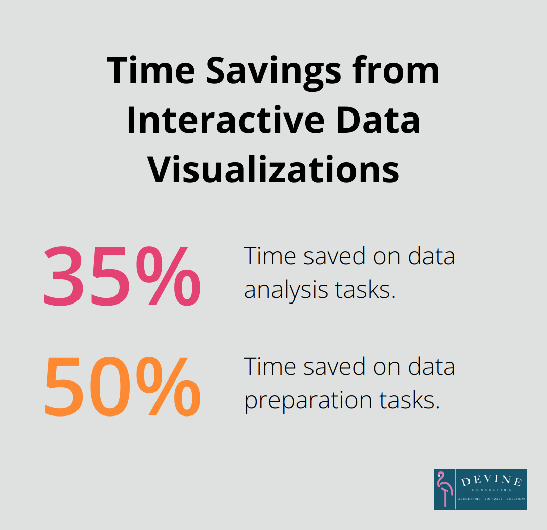
Incorporate Interactive Elements
Static presentations no longer suffice in today’s dynamic business environment. Interactive elements significantly enhance engagement and understanding. Tools like Power BI create dynamic dashboards where stakeholders explore specific data points for detailed information.
Forrester reports that interactive data visualizations can lead to time savings of 35% on data analysis and 50% on data preparation tasks. Allowing your audience to explore the data themselves facilitates a deeper understanding of your financial story.
Maintain Design Consistency
Consistency in design creates a cohesive narrative that’s easy to follow. Use the same fonts, color schemes, and chart styles throughout your presentation. This consistency helps your audience focus on the content rather than getting distracted by changing visual elements.
When financial data appears in a visually consistent manner, your audience draws connections and understands trends across different sections of your report more easily.
Simplify Complex Data
Try to simplify complex financial data without losing its essence. Break down intricate concepts into digestible chunks. Use infographics to illustrate complex processes or relationships between different financial metrics.
For instance, a waterfall chart effectively shows how different factors contribute to the final bottom line (e.g., starting revenue, various expenses, and final profit). This visual representation helps stakeholders quickly grasp the impact of each element on the overall financial picture.
Final Thoughts
Creating an effective finance report presentation requires a deep understanding of your audience and strategic use of data visualization techniques. You must tailor your content to match the financial literacy level of your stakeholders and structure your report logically to facilitate quick comprehension. The power of visual representation cannot be overstated in financial presentations (choosing appropriate charts and using color strategically can make complex data more engaging).
At Devine Consulting, we recognize the importance of clear, impactful financial communication. Our comprehensive accounting solutions and strategic financial planning services help businesses across various industries achieve financial stability and growth. You can focus on your core operations while we ensure your financial reporting practices meet the highest standards.
Continuous improvement in financial reporting is essential to stay ahead in today’s dynamic business environment. As you apply these techniques to your finance report presentations, your ability to communicate complex financial information will improve. This leads to better decision-making and enhanced organizational performance.