How to Create an Effective Financial Dashboard Report
Financial dashboard reports are powerful tools for businesses to gain quick insights into their financial health. At Devine Consulting, we’ve seen how these reports can transform decision-making processes and drive growth.
In this post, we’ll guide you through creating an effective dashboard finance report that delivers clear, actionable information. We’ll cover everything from selecting the right KPIs to designing an intuitive layout that speaks to your stakeholders.
What Are Financial Dashboard Reports?
The Power of Visual Financial Data
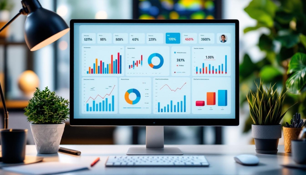
Financial dashboard reports transform complex financial data into clear, visual representations. These powerful tools consolidate critical financial metrics into a single, easy-to-read interface. Think of it as a financial control center, displaying up-to-date information on revenue, expenses, profit margins, and other vital indicators.
Key Components for Effective Dashboards
An effective financial dashboard doesn’t just throw numbers and charts together. It presents a carefully curated set of indicators that tell a story about your business’s financial performance. Key components typically include:
- Revenue metrics (total revenue, revenue growth, revenue by product/service)
- Profitability indicators (gross profit margin, net profit margin, EBITDA)
- Liquidity measures (current ratio, quick ratio, cash flow)
- Efficiency ratios (inventory turnover, accounts receivable turnover)
- Debt and leverage metrics (debt-to-equity ratio, interest coverage ratio)
The specific metrics will vary based on your industry and business model. A construction company might focus on project profitability and cash flow forecasting, while a SaaS company might prioritize customer acquisition cost and lifetime value.
Revolutionizing Financial Decision-Making
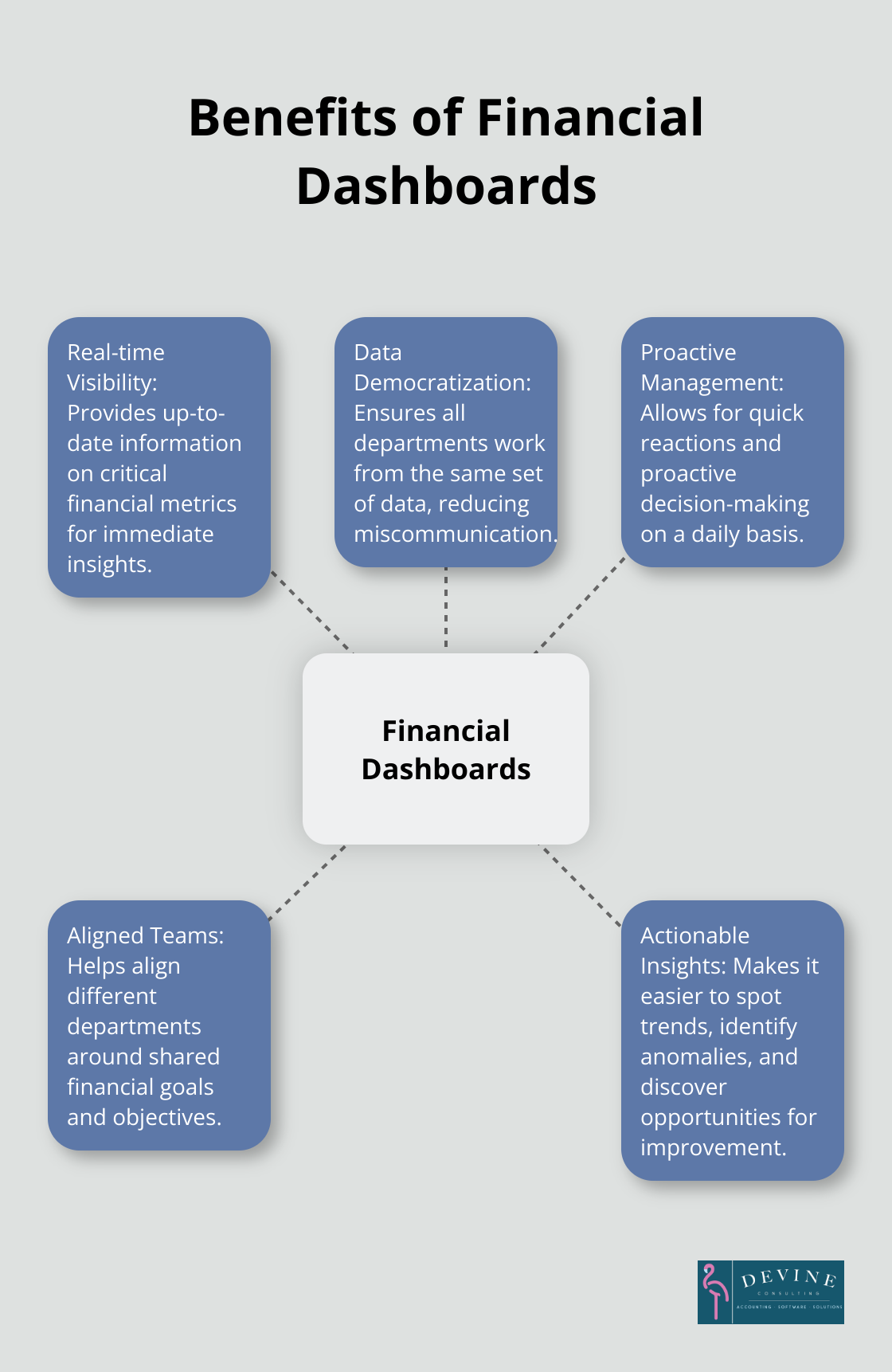
Financial dashboards offer numerous benefits for businesses. They provide real-time visibility into financial performance, allowing for proactive management and quick reactions on a daily basis.
Moreover, dashboards democratize financial data within an organization. They ensure all departments work from the same set of data, reducing miscommunication and aligning teams around shared goals.
Uncovering Actionable Insights
The most significant benefit of financial dashboards lies in their ability to uncover actionable insights. By presenting data visually, dashboards make it easier to spot trends, identify anomalies, and discover opportunities for improvement.
For example, a dashboard might show that while overall revenue grows, profit margins shrink. This insight could prompt an investigation into rising costs or pricing strategies, leading to targeted actions to improve profitability.
As we move forward, we’ll explore how to select the right Key Performance Indicators (KPIs) for your financial dashboard, ensuring you capture the most relevant and impactful data for your business.
Choosing the Right KPIs for Your Financial Dashboard
Core Financial KPIs
Every business should track certain fundamental financial KPIs. These include:
- Revenue Growth Rate: This metric shows how quickly your top line expands. About a quarter of companies don’t grow at all, and between 2010 and 2019, only one in eight achieved more than 10 percent revenue growth.
- Gross Profit Margin: This indicates the efficiency of your core operations. The average gross profit margin across all industries is around 50% (according to NYU Stern School of Business data).
- Net Profit Margin: This reveals your overall profitability after all expenses. S&P 500 companies averaged a net profit margin of 11.4% in 2021 (FactSet).
- Operating Cash Flow: This shows your ability to generate cash from regular business activities. A positive trend here indicates long-term sustainability.
- Current Ratio: This liquidity metric helps assess your short-term financial health. A ratio between 1.5 and 3 is generally considered healthy for most industries.
Industry-Specific Metrics
While core financial KPIs are universal, industry-specific metrics can provide deeper insights. For example:
In construction, project profitability and cost variance are critical. The Construction Financial Management Association reports that top-performing construction companies maintain a net profit margin of 10% or higher.
For SaaS companies, Customer Acquisition Cost (CAC) and Customer Lifetime Value (CLV) are vital. A healthy CLV:CAC ratio should be 3:1 or higher.
In retail, same-store sales growth and inventory turnover are key. Healthy retailers typically turn over inventory 8-12 times per year.
Balancing Lagging and Leading Indicators
A well-rounded dashboard should include both lagging and leading indicators. Lagging indicators, like revenue or profit, show past performance. Leading indicators, such as sales pipeline or customer satisfaction scores, hint at future performance.
Employee satisfaction can be a leading indicator for customer satisfaction and, ultimately, financial performance. A Gallup study found that business units with high employee engagement achieve 21% higher profitability.
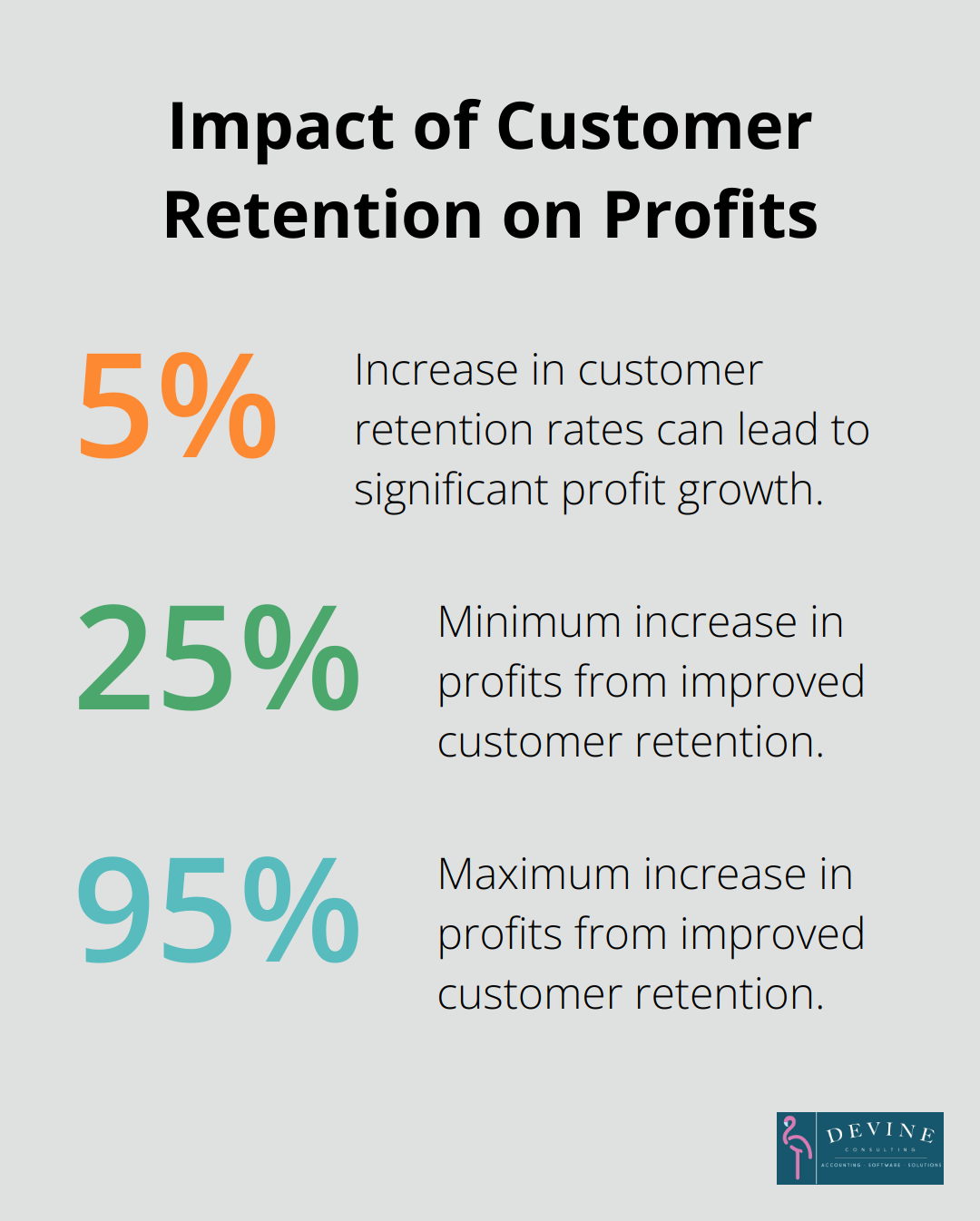
Customer churn rate is another important leading indicator, especially for subscription-based businesses. Increasing customer retention rates by 5% increases profits by 25% to 95%.
When selecting KPIs, try to include a mix that tells a complete story of your financial health – past, present, and future. Start with 5-7 core metrics and adjust based on your specific needs and goals.
The most effective KPIs align closely with your strategic objectives. They should be easily measurable, actionable, and relevant to your decision-makers.
Implementing Your KPIs
Once you’ve selected your KPIs, consistent tracking and analysis become key. Set up systems to automatically update your dashboard with fresh data. This could involve integrating your accounting software, CRM, and other data sources.
Regular review sessions with key stakeholders can help ensure your KPIs remain relevant and actionable. As your business evolves, adjust your metrics to reflect new priorities or challenges.
With the right KPIs in place, you’re ready to move on to the next critical step: designing an intuitive and informative layout for your financial dashboard. This step will transform your carefully selected metrics into a powerful visual tool for decision-making.
How to Design a Clear and Effective Dashboard Layout
Prioritize Visual Hierarchy
The organization of information based on importance is key to an effective financial dashboard. Place critical metrics at the top left of your dashboard. Users typically spend 80% of their time looking at information above the page fold (according to a Nielsen Norman Group study). This means revenue, profit margins, and cash flow metrics should occupy prime positions.
Size and color can emphasize important data points. Larger elements attract more attention, while strategic color use can highlight trends. For example, green might indicate metrics above target and red for those below.
Visual hierarchy in financial dashboards is crucial for creating powerful and intuitive visualizations oriented toward communicating data to students, coworkers, and other stakeholders.
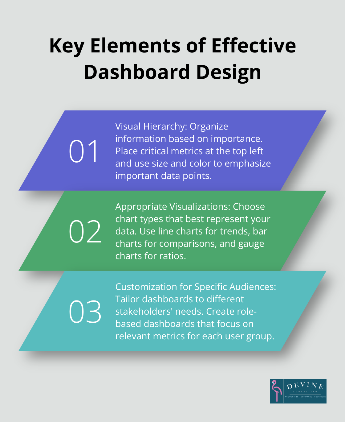
Choose Appropriate Visualizations
Different data types require specific visualizations. Line charts excel at showing trends over time, making them ideal for revenue growth or cash flow projections. Bar charts work well for comparisons, such as actual vs. budgeted expenses across departments.
Gauge charts can effectively display financial ratios like current ratio or debt-to-equity. These provide quick visual cues of performance relative to targets.
Try to limit the number of chart types on your dashboard. A core set of consistent visualizations helps users interpret data across different metrics quickly.
Customize for Specific Audiences
Different stakeholders require varying levels of detail. A CEO might need a high-level overview of company-wide performance, while a department head requires more granular data for their area.
Role-based dashboards cater to different user needs. A CFO dashboard might focus on overall financial health, including debt ratios and cash flow projections. A sales manager’s dashboard would emphasize revenue by product line, sales team performance, and customer acquisition costs.
Customized dashboards can significantly increase user adoption, particularly when tailored for senior executives in the financial sector.
Implement Interactive Elements
Interactive elements can enhance dashboard functionality. Drill-down capabilities allow users to explore data in more detail. Filters enable users to focus on specific time periods, departments, or product lines.
Hover-over tooltips can provide additional context or explanations for complex metrics. This feature helps users understand the data without cluttering the main dashboard view.
Maintain Consistency and Simplicity
A consistent design across all dashboard elements improves usability. Use a uniform color scheme, font, and layout throughout. This consistency helps users navigate and interpret data more easily.
Simplicity is key in dashboard design. Avoid overcrowding your dashboard with too much information. Each element should serve a specific purpose and contribute to the overall story your data tells.
White space (or negative space) is a powerful design tool. It helps separate different sections of your dashboard and makes the layout more readable. Don’t be afraid to leave some areas of your dashboard empty.
Final Thoughts
An effective dashboard finance report transforms financial data into actionable insights. It drives informed decision-making across your organization through carefully selected KPIs, intuitive layouts, and stakeholder-specific customizations. Your financial dashboard must evolve with your business to reflect new priorities and challenges as your company grows and market conditions change.
Creating a robust financial dashboard can challenge businesses without dedicated financial expertise. Devine Consulting offers comprehensive accounting solutions tailored to various industries, including construction, oil and gas, and real estate. We provide strategic financial planning to help your business achieve stability and growth, going beyond accurate bookkeeping and financial reporting.
Devine Consulting enables you to focus on your core operations while we handle financial reporting and analysis intricacies. Our full-service approach (represented by our mascot FRANK the Flamingo) emphasizes fun, reliability, accessibility, nurturing, and knowledge. A well-designed dashboard finance report is a strategic tool that can drive your business forward, providing clear visibility into your financial health.