How to Create an Effective Annual Finance Report Template

Creating an effective annual finance report template is essential for clear financial communication. At Devine Consulting, we understand the importance of presenting complex financial data in an accessible format.
This guide will walk you through the key components of a robust template and provide practical tips for designing user-friendly reports. We’ll also share best practices for data presentation to help you create impactful financial reports.
Key Components of an Annual Finance Report
An annual finance report provides a comprehensive overview of a company’s financial performance and position. This section outlines five essential components that form the backbone of an effective annual finance report.
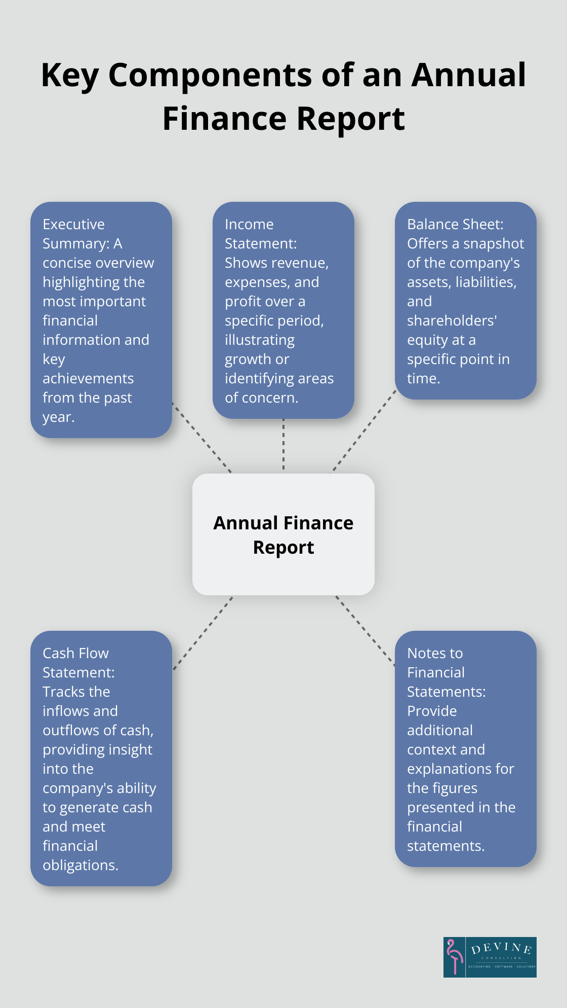
Executive Summary
The executive summary is the first section readers encounter. This concise overview highlights the most important financial information and key achievements from the past year. We recommend a one to two-page summary that focuses on top-line revenue, net income, and significant changes in the company’s financial position.
Income Statement
The income statement (also known as the profit and loss statement) shows revenue, expenses, and profit over a specific period. Clear presentation of this information, with year-over-year comparisons, illustrates growth or identifies areas of concern. This statement helps stakeholders understand the company’s profitability and operational efficiency.
Balance Sheet
The balance sheet offers a snapshot of the company’s assets, liabilities, and shareholders’ equity at a specific point in time. This statement is essential for assessing the company’s financial stability and liquidity. It provides insights into the company’s ability to meet short-term obligations and its long-term financial structure.
Cash Flow Statement
The cash flow statement tracks the inflows and outflows of cash, providing insight into the company’s ability to generate cash and meet its financial obligations. This statement is particularly important for businesses in capital-intensive industries or those experiencing rapid growth. It helps stakeholders understand how the company manages its cash resources.
Notes to Financial Statements
The notes to financial statements provide additional context and explanations for the figures presented in the financial statements. They are used to explain the assumptions used to prepare the numbers in the financial statements as well as the accounting policies adopted by the company. Clear, concise notes enhance understanding without overwhelming the reader with unnecessary details.
These key components create a comprehensive document that provides stakeholders with a clear and accurate picture of a company’s financial health. The next section will explore how to design a user-friendly template that effectively presents this critical information.
How to Design a User-Friendly Finance Report Template
Prioritize Clarity in Layout
A clear layout forms the foundation of an effective finance report template. Organize information in a logical flow, starting with the executive summary and progressing through financial statements. Use ample white space to prevent information overload and improve readability. The Nielsen Norman Group found that readers typically scan documents in an F-shaped pattern, which remains relevant even on mobile devices. Place key information along the top and left side of each page to align with this reading pattern.
Maintain Consistency in Formatting
Consistency in formatting enhances professionalism and aids in quick information processing. Use a single font family throughout the document, with different sizes and weights for headings and body text. The Software Usability Research Laboratory at Wichita State University found that sans-serif fonts like Arial or Helvetica are most readable for on-screen documents. For print reports, serif fonts like Times New Roman can improve readability.
Leverage Visual Elements for Data Representation
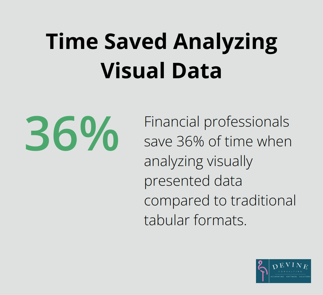
Visual elements transform complex financial data into easily digestible information. Include charts, graphs, and infographics to illustrate trends and comparisons. A 2018 study published in the Journal of Accountancy revealed that financial professionals spend 36% less time analyzing data when it’s presented visually compared to traditional tabular formats. When creating charts, follow the data-ink ratio principle introduced by Edward Tufte, which emphasizes maximizing the ink used to present data while minimizing non-data ink.
Implement Strategic Color Coding
Color coding significantly enhances navigation and data interpretation in finance reports. Use a consistent color scheme throughout the document, assigning specific colors to different types of information or financial metrics. However, limit your palette to 3-5 colors to avoid confusion. Consider color-blind readers by avoiding red-green combinations and opting for high-contrast color pairs. Tools like ColorBrewer can help you select color-blind friendly palettes for your reports.
Optimize for Digital and Print
In today’s digital age, it’s important to design your template for both digital and print formats. Ensure that your template is easily readable on screens of various sizes (from desktop monitors to tablets and smartphones). For digital versions, consider interactive elements such as clickable table of contents or hyperlinked sections for easy navigation. For print versions, pay attention to page breaks and ensure that important information isn’t split across pages.
These design principles will help you create a finance report template that not only presents data accurately but also enhances understanding and engagement among your audience. The next section will explore best practices for presenting financial data within your newly designed template.
How to Present Financial Data Effectively
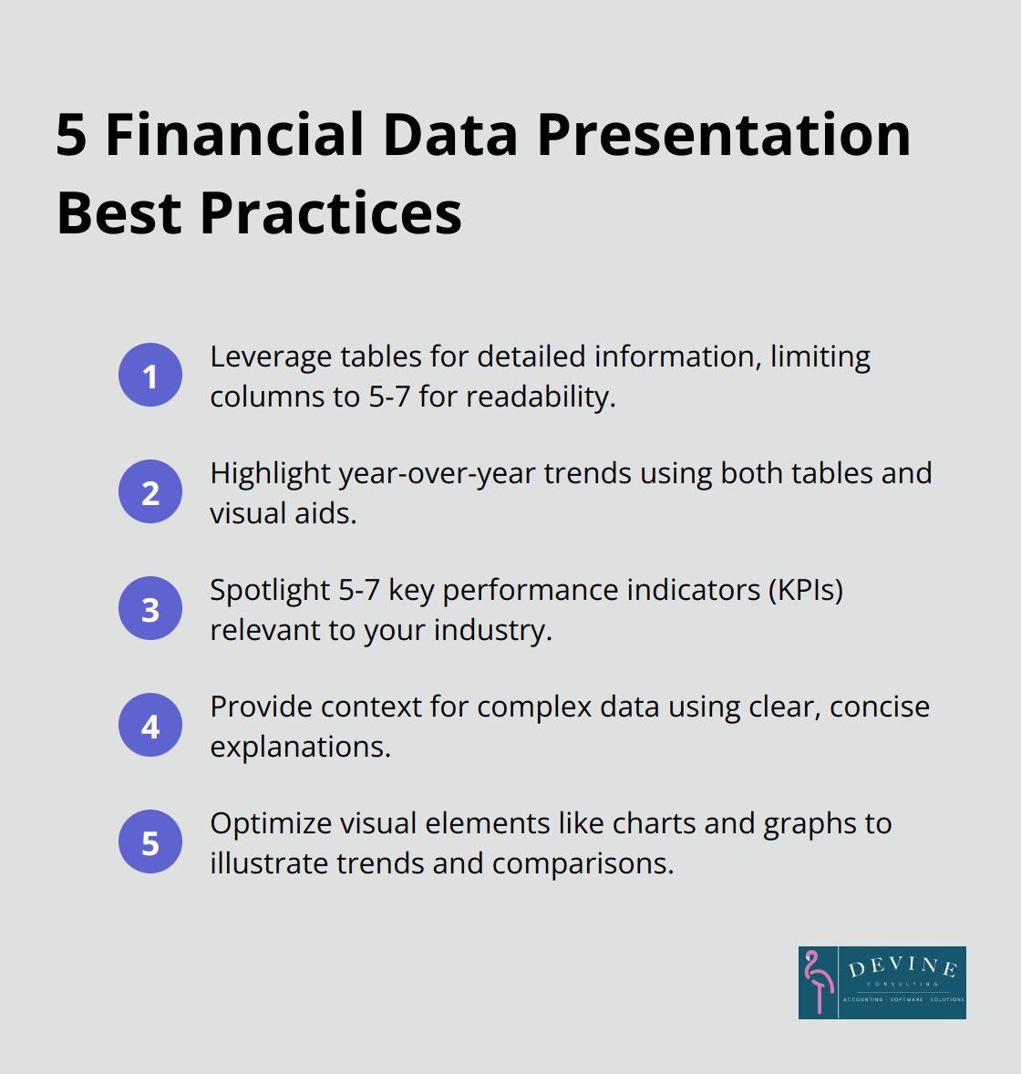
Leverage Tables for Detailed Information
Tables provide an excellent format for presenting detailed financial information. They allow easy comparison of multiple data points and offer a structured layout for complex financial data. Limit the number of columns to 5-7 to prevent overwhelming the reader. Use alternating row colors to improve readability, especially for large datasets. The Financial Accounting Standards Board (FASB) recommends a consistent format for tables throughout your report to facilitate easier comprehension.
Highlight Year-over-Year Trends
Year-over-year comparisons offer valuable insights into a company’s financial health and growth trajectory. Present these comparisons prominently in your report, using both tables and visual aids. A simple bar chart can effectively illustrate revenue growth over the past 3-5 years. The Securities and Exchange Commission (SEC) suggests including at least three years of comparative data in annual reports to provide adequate context for financial trends.
Spotlight Key Performance Indicators
Key Performance Indicators (KPIs) offer a quick snapshot of a company’s financial health. Implement best practices for setting up, measuring, and tracking KPIs to achieve your business goals & objectives. Identify 5-7 critical KPIs relevant to your industry and showcase them prominently in your report. For example, in the construction industry, metrics like gross profit margin, current ratio, and days sales outstanding are particularly relevant. Present these KPIs using eye-catching graphics or callout boxes to draw attention to these important metrics.
Provide Context for Complex Data
Raw numbers alone often fail to tell the full story. Accompany complex financial data with clear, concise explanations to provide context and enhance understanding. Use plain language and avoid jargon where possible. If industry-specific terms are necessary, consider including a glossary. The CFA Institute recommends limiting explanations to 2-3 sentences per data point to maintain reader engagement while providing necessary context.
Optimize Visual Elements
Visual elements transform complex financial data into easily digestible information. Include charts, graphs, and infographics to illustrate trends and comparisons. A visual representation of sales growth over time can guide decisions on product development and investment. When creating charts, follow the data-ink ratio principle (introduced by Edward Tufte), which emphasizes maximizing the ink used to present data while minimizing non-data ink. For more advanced visualization techniques, consider enhancing financial reporting with Tableau.
Final Thoughts
An effective annual finance report template communicates your company’s financial health to stakeholders. It provides a comprehensive overview of your financial position through key components like the executive summary, income statement, balance sheet, cash flow statement, and notes to financial statements. A well-designed template enhances clarity and accessibility, making complex financial data more digestible for readers.
Clear and accessible financial reporting fosters trust and transparency with investors, creditors, and other interested parties. User-friendly design elements such as logical layout, consistent formatting, and strategic use of visual aids ensure that financial information is easily understood by a wide range of stakeholders. Customizing your annual finance report template to meet specific business needs allows you to highlight the most relevant financial metrics for your industry and company.
Devine Consulting can help you develop a customized annual finance report template that meets regulatory requirements and effectively communicates your financial story. Our team of experts ensures your financial reporting is accurate, clear, and strategically aligned with your business goals (while you focus on core operations). A well-crafted template is a powerful tool for decision-making and stakeholder communication in today’s fast-paced business environment.